What makes an fte watch tick?
We have searched through our fte archive and then compiled images from the very beginning, documenting from first sketch to shop floor. Almost 2 years in the making, with a lot of passion, hard work & plenty of prototyping, our Creative Director Kirsty Whyte has selected the behind the scenes highlights of what makes an fte watch tick.
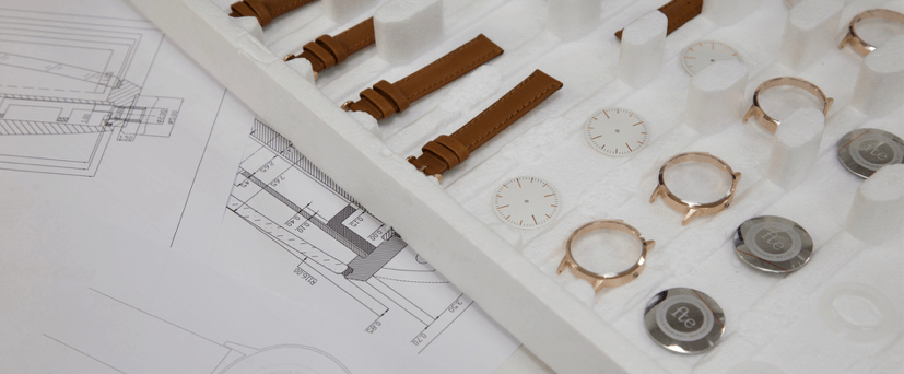
What are the core principles in our design that sets us apart?
We are design lovers first and foremost. We are our target customers!
Our name - "Freedom To Exist (fte)" - represents our desire to move away from the noise of branding and technology. Our timepieces are non-branded and an antidote to the Applewatch/Fitbit’s of this world. An fte watch is an exquisite product that tells the time, nothing more and nothing less.
I could never find a watch that fitted her small wrists that was also free from over-branding and diamantes. We wanted a modern clean design with a vintage aesthetic, which both men and women could wear.
Define an fte Design
Honesty - We do not dress things up or hide behind pretty words and design jargon. We let our design speak for itself.
Considered - A piece is only finished when it’s been tried, tested, tweaked, changed and we have fallen in love with it. If it doesn’t have design details we’re proud of, then we are not done.
Affordable - Our prices are fair, for design lovers of every walk of life.
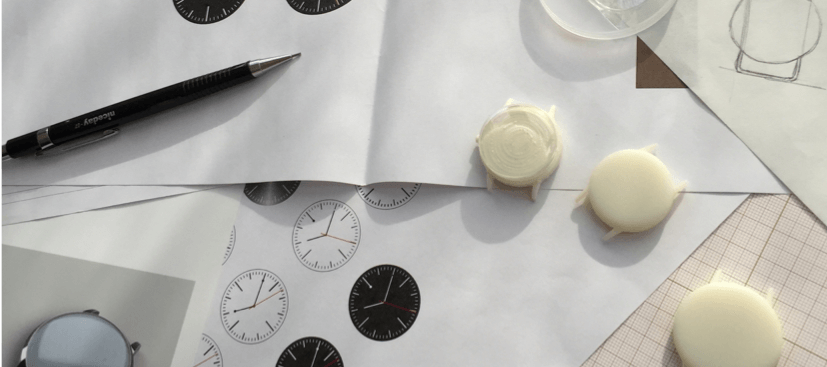
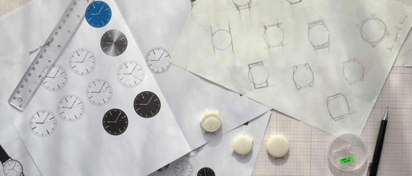
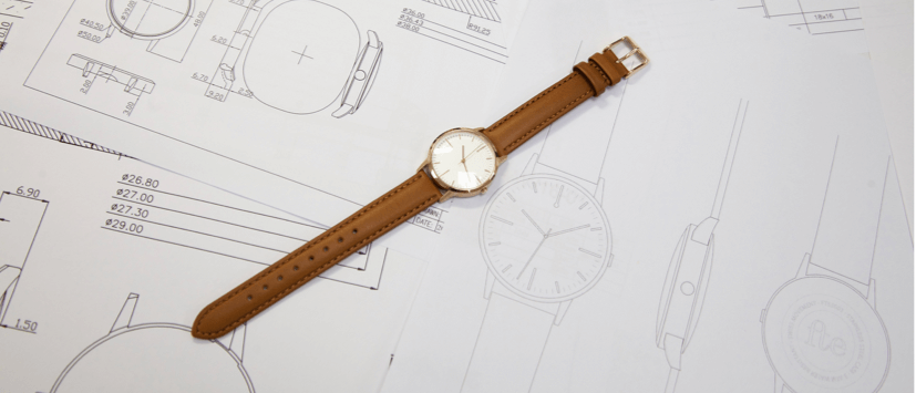
As with every design, we started with putting pen to paper. Brainstorms, sketches, we quickly found our identity and what we wanted the watch to look like.
The design was based upon key elements the team loved about vintage timepieces, and extra care was taken on the sizing on the strap to ensure that it would comfortably fit those with a petite, average or large wrist.
As with every design, we started with putting pen to paper. Brainstorms, sketches, we quickly found our identity and what we wanted the watch to look like.
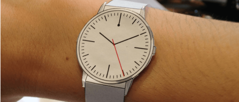
The design was based upon key elements the team loved about vintage timepieces, and extra care was taken on the sizing on the strap to ensure that it would comfortably fit those with a petite, average or large wrist.
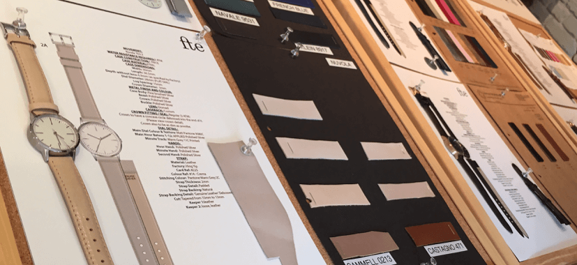
That was the easy bit! Now developing and prototyping began.
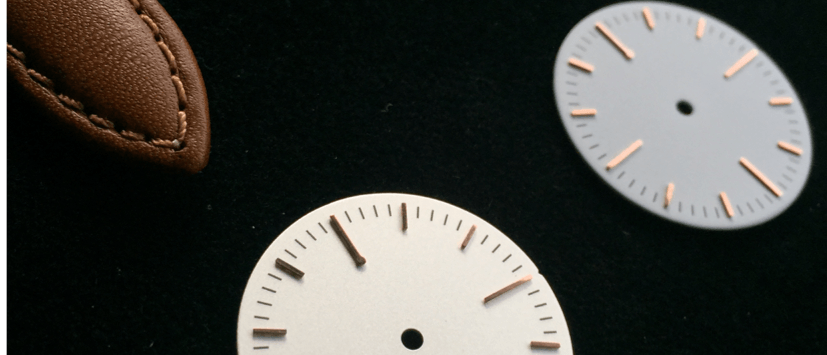
We are a self-funded bootstrap start up so wanted to be closely involved in every element of the design. From the domed glass, to the applied markings, and most of all our covert branding.
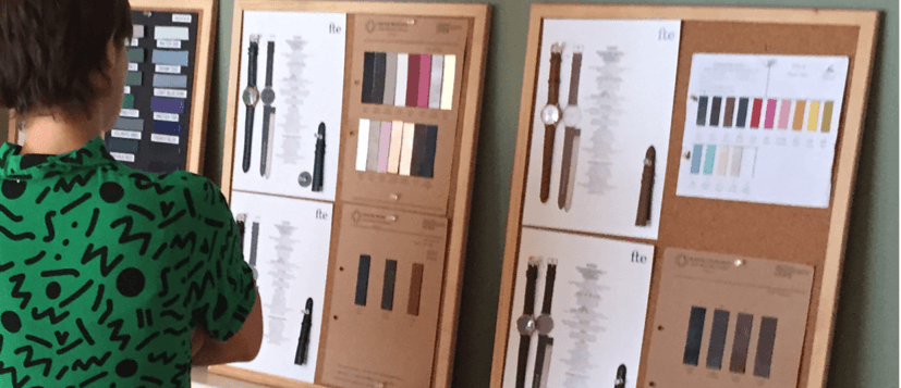
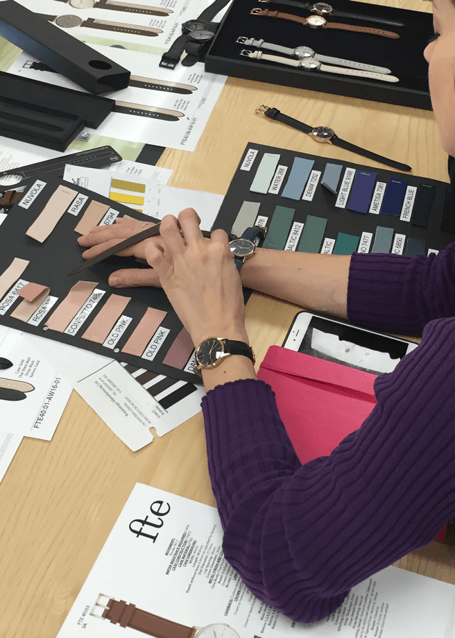
We wanted to choose tones that complimented your clothing rather than shouting out for attention. Keeping them timeless, rather than jumping on seasonal trends or gender specific colour combinations.
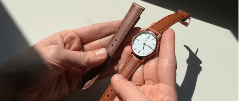
Who would have thought choosing just the right leather colour would have been so hard! We prototyped lots of slight variations, even user trialing on ourselves and with friends & family, to make sure we had not missed anything.
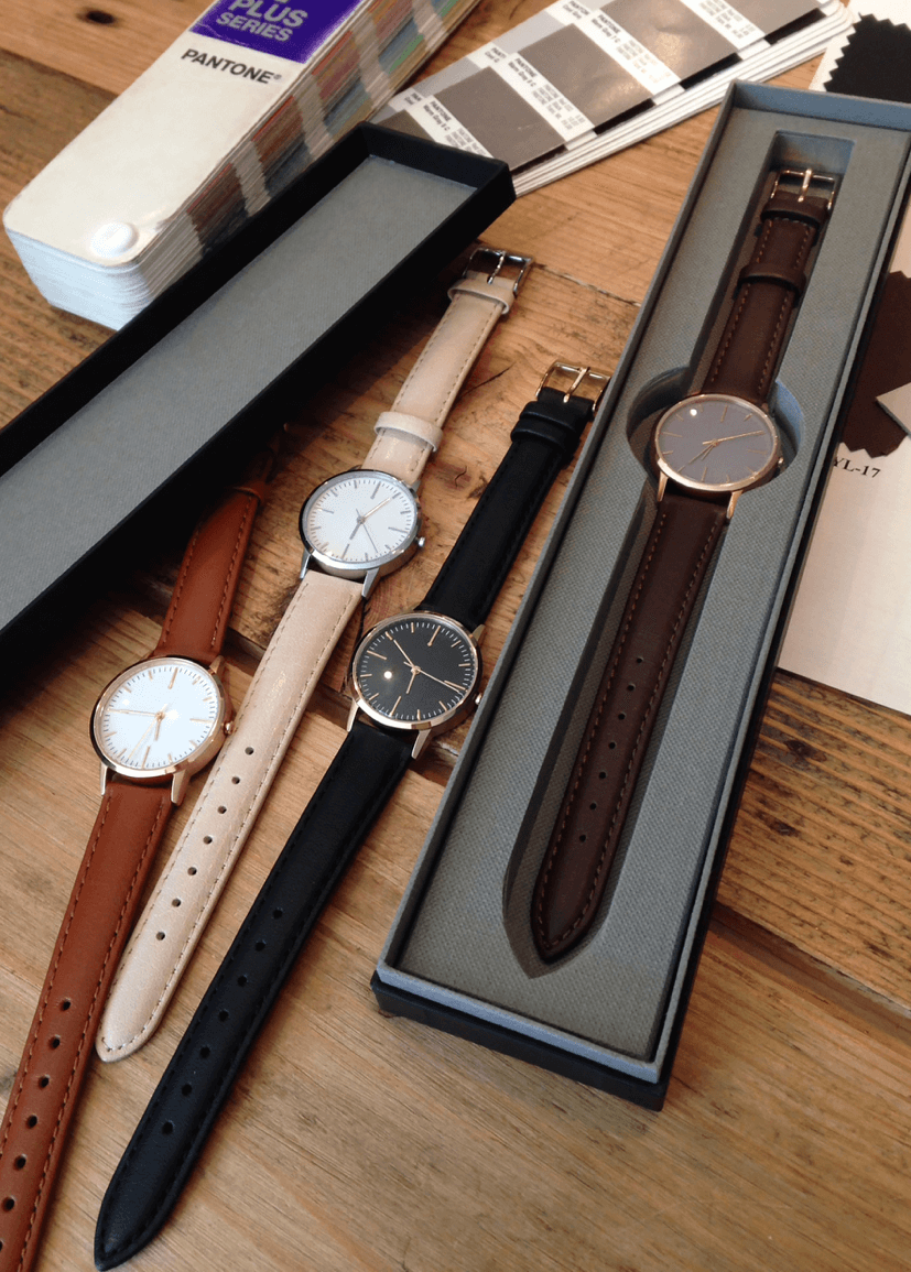
After much deliberation, our final five colourways were selected. Our debut collection, the 30 Edition, comprised of Gold & Black, Rose Gold & Tan, Rose Gold & Brown, Silver & Nougat and Silver & Grey.
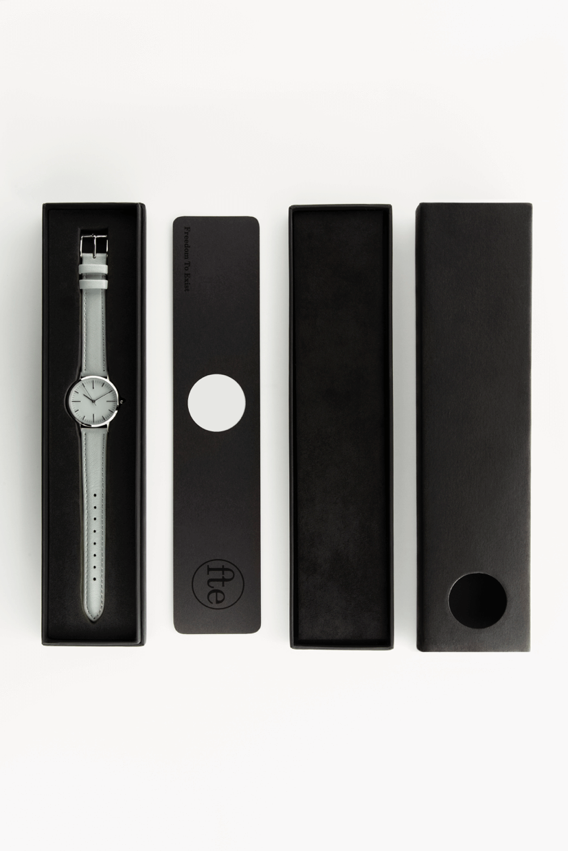
With the watch finalised, it was time for the packaging. We wanted our core principles to follow though. Keeping our watches safe during their journeys around the world and giving our customers the best out-of-the-box experience possible.
We kept the box slim and easy to open, with a simple insert with minimal text. The insert contains a link to our support page, for if you want to get geeky and read up about all our design elements.
With everything complete we took a deep breath and pushed the button on production.
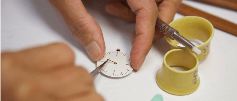
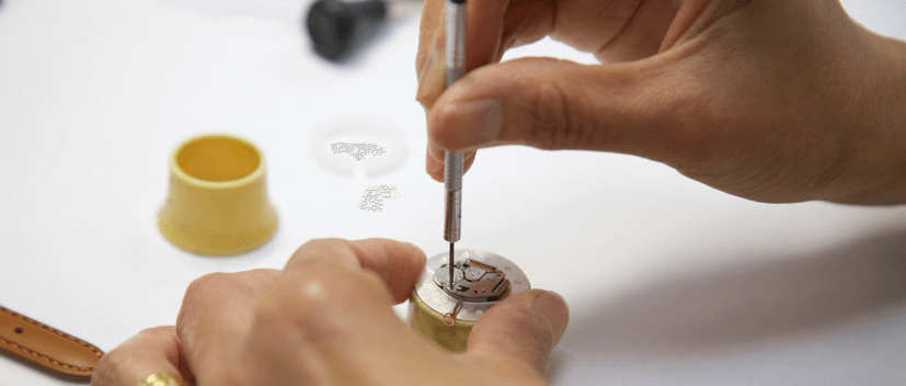
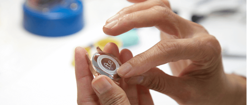
While our first batch of watches were being manufactured, we had our first photoshoot with the prototypes in London. True to the brand, we kept it low-key with honest imagery that reflected everyday life moments captured on camera.
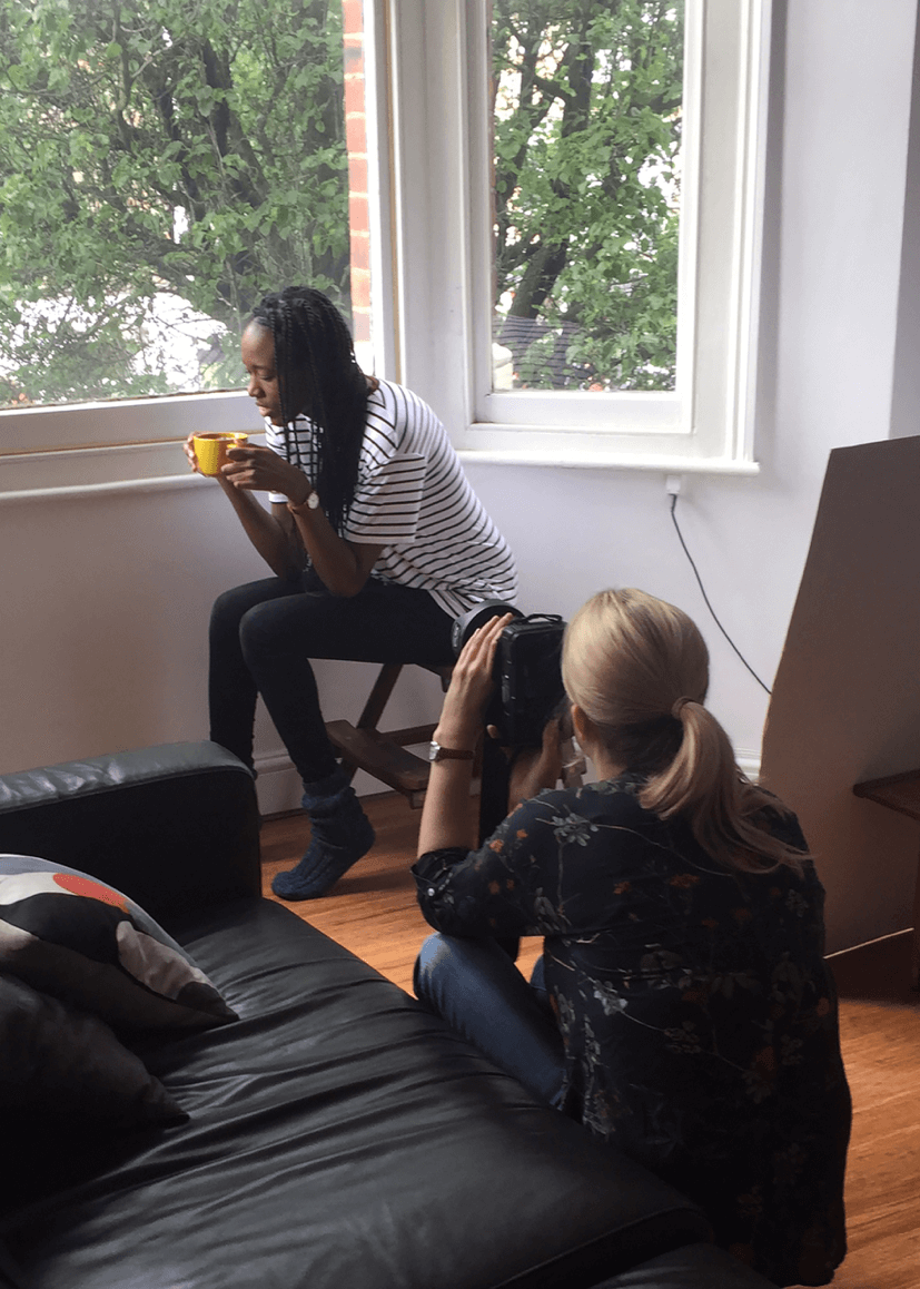

We created and launched our Instagram, Facebook, Pinterest and the fte website in October 2015, and started adding our newly taken images to each platform. Instagram took off particularly quickly with us gaining 500 followers during our first weekend. It is consistently been our strongest performing platform, with us aiming to reach 15k followers by Christmas 2016.
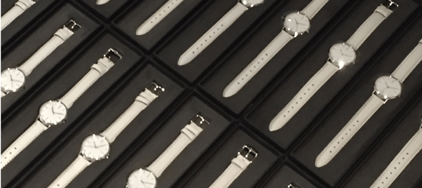
After what seemed like forever, our first order arrived in November 2015. We checked every single watch ourselves making sure they were just right!
Our website initially was the only place to you could purchase an fte watch from, our first sale came within two days of the stock arriving to a UK customer who bought two. With Christmas looming, we started contacting retailers and lined up appointments with SCP and SKANDIUM, who became our first bricks and mortar partners.
Today – 1 year on
Since we launched a year ago, fte has been a project that we have learnt a huge amount from. Our debut collection – the 30 Edition - was aimed primarily at women, but we had so many positive comments about the design from people wishing to have a larger version, that we took to Kickstarter to fund a larger 40mm (40 Edition) watch.
The 40 Edition takes all the same design principles as the 30 Edition, and scales them up. The sizing of the watch was a huge part of the reasoning behind the project, and we did the same for the new design, ensuring it would fit Men or Women that preferred a larger face, catering for petite, average or large wrists. Our Kickstarter campaign was successfully funded in April 2016 and the 150 backers received their watches in September 2016.


